Reporter is a reporting tool based Metabase that enables users to create, share, and collaborate on reports and dashboards, pulling data from CROSS and other data sources.
Users can query data, apply filters and aggregations, and create visualizations such as charts, graphs, and tables. These visualizations can be combined to create interactive dashboards that provide a comprehensive view of the network's data.
Ease of Use
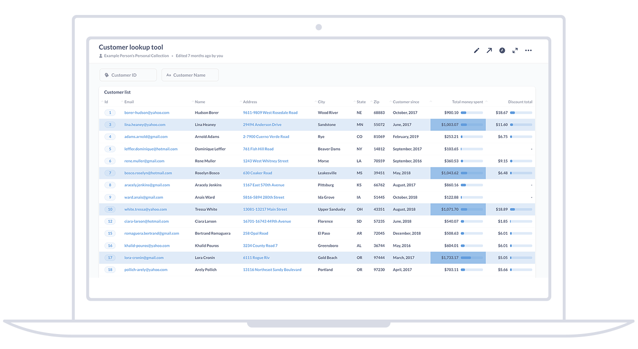
User-friendly interface that makes it easy for non-technical users to explore data, create reports, and generate visualizations. The intuitive drag-and-drop interface and natural language querying capabilities enable users to interact with data without requiring extensive technical skills or knowledge of SQL.
Data Exploration
Explore and analyze data in a flexible and interactive manner. They can ask questions using natural language queries, apply filters, and perform aggregations to drill down into specific aspects of the data.
Visualization Options
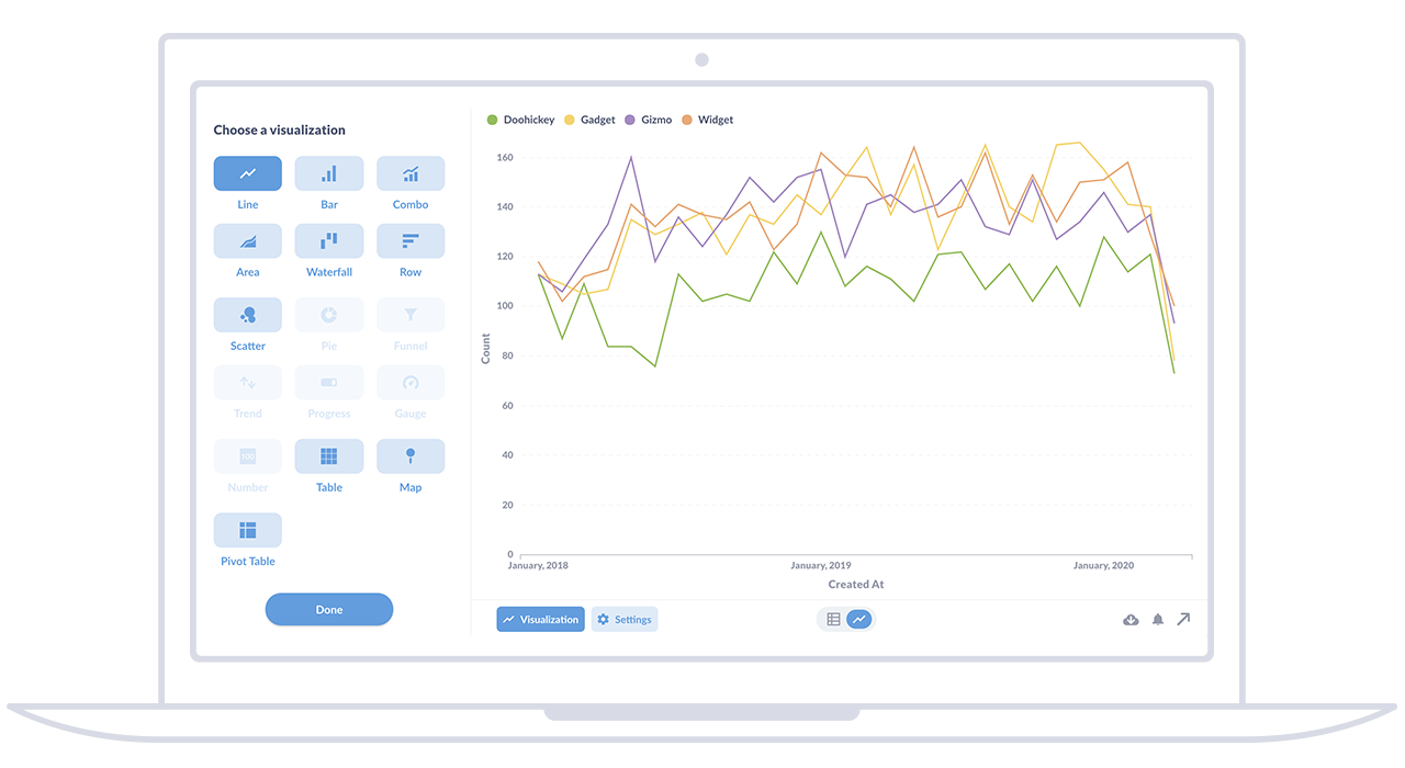
Provides a variety of visualization options to represent data in a meaningful way. Users can choose from different chart types, such as bar charts, line charts, pie charts, and maps, to create visually appealing and informative reports.
Interactive Dashboards
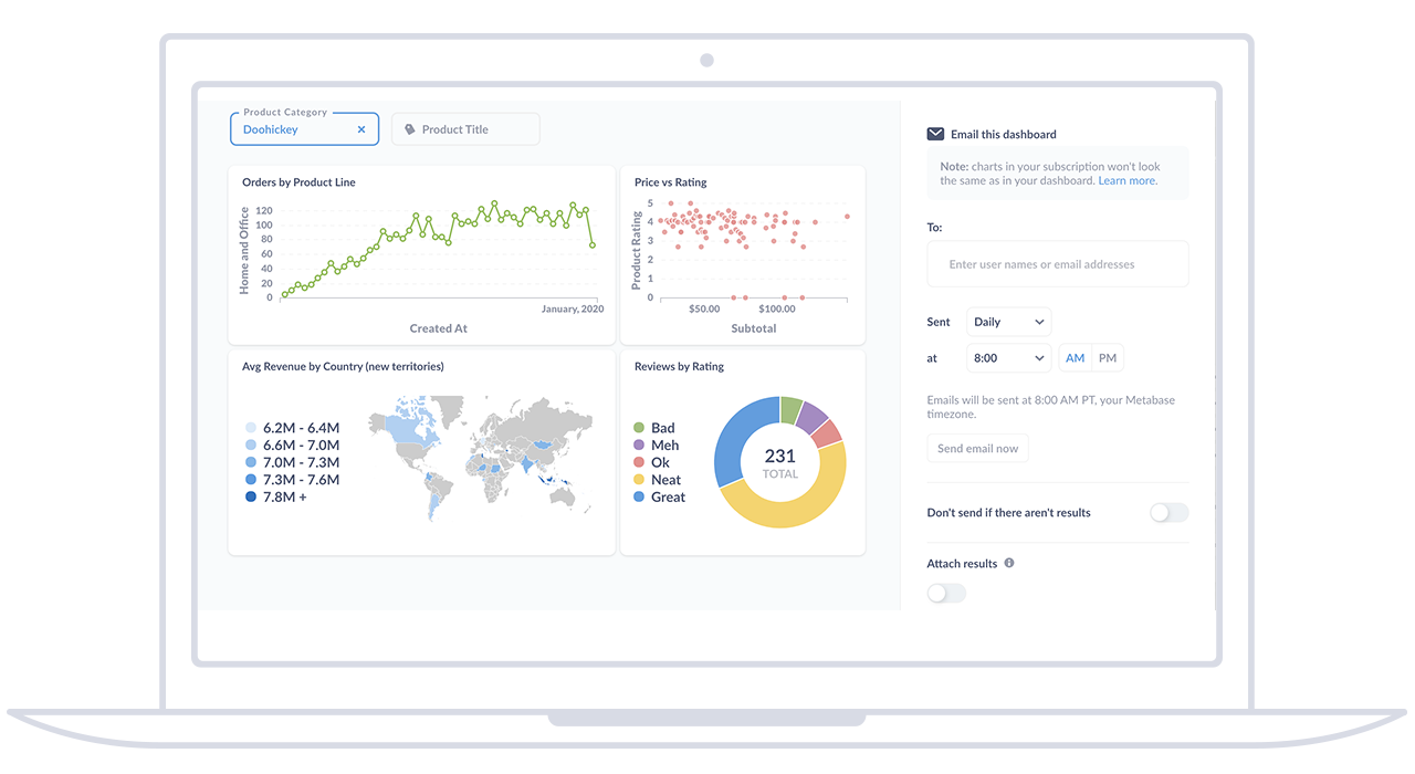
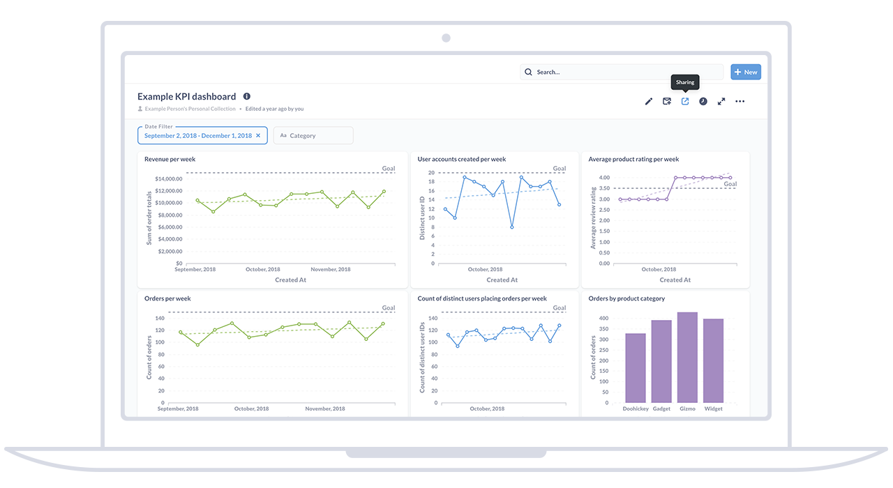
Create interactive dashboards by combining multiple visualizations and reports. Dashboards provide a consolidated view of data and enable users to explore different dimensions, apply filters, and interact with the data in real time.
Collaboration and Sharing
Supports collaboration and sharing of reports and dashboards. Users can share their findings by simply sending a link or embedding the reports in other applications. The ability to set access controls ensures that data is shared securely and only with authorized individuals.